Hot n cold: what colours make a lasting impression on readers
Website Editor • February 26, 2020
Colour is one of the most powerful visual elements we have. In art or in business, you can use colour to influence people, create moods, communicate ideas and make an impression on the reader or viewer.

Warm Colours
Pink
Largely labeled a “girly colour”, we use pink usually to communicate sensitivity, romance, innocence and a female touch. It’s a great accent colour that adds a pop of fun.
Red
The colour red immediately draws attention as it’s one of the most vibrant colours on the spectrum. We associate red with danger (think blood and stop signs) but also vitality, romance and half of the Christmas colour scheme.
Orange
Closely related to the fruit of the same name and colour, orange represents health, nutrition, energy and life. We associate it with fire and the sun. You can use orange to grab attention in a more fun and less striking way than with red.
Yellow
Yellow is widely related to cheerfulness and hopefulness. Also associated with the sun, we connect yellow with warm, freshness and youth over everything else.
Green
Most commonly green is used to evoke thoughts of nature, feelings that are fresh, clean, organic and full of life. It’s a cheerful and bright colour, or you can use a darker shade to communicate maturity and stability.
Cool Colours
Blue
If you’re looking for depth, serenity and calm, think blue. We think of the sky and the ocean, two of the largest natural elements we see regularly. Blue also communicates cleanliness and purity, used on a lot of cleaning products in the form of fresh, clean water.
Purple
Depending on the shade, purple can also be a warm colour, but more often it’s cool. Deeper purples are typically associated with maturity, sophistication, royalty or regality. Lighter purples are more closely connected to youth, creativity, fun and femininity.
Black
It’s hard sometimes to use black properly because it’s so powerful it can overpower your design. But used right, it can communicate elegance and power. A design that is meant to be sleek and sophisticated can benefit from sharp and clean black shapes or lettering.
Brown, Gray, White
These colours tend to work best as accents or backgrounds, especially tinted shades of grey. It’s becoming more and more popular to use grey as a colour for text as opposed to black. These colours can help to make the above colours pop. For design, white is falling out of popularity as a background and light shaded colours are taking its place. But it can still be a powerful element for communicating purity, minimalism, cleanliness and simplicity. Browns can sometimes communicate the opposite - dirt and decay - but can also communicate earthiness and humility.
Articles

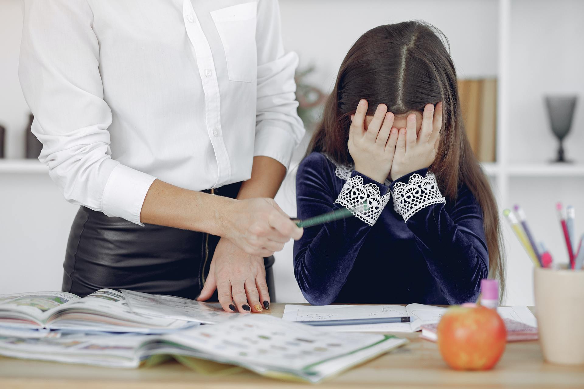
The United Nations has described the disruption to education caused by the pandemic as ‘unparalleled’. At the virus’ worldwide peak in April, it is estimated that over 90% of all enrolled learners, from kindergarten to bachelors and beyond, had their education affected by school closures and the pandemic (UNESCO). For many university students and older children, they have had to adapt quickly to online learning. They can keep in touch with their peers and teachers online and continue their studies, albeit in a highly modified way. As challenging as this may be, this experience will help equip them for a future that is increasingly online. For parents of younger children, they are assuming a new role: their child’s home school teacher. This is in addition to their usual childcare and household duties, their work responsibilities and often emotional and financial worries caused by the pandemic. Stressful? Yes. The good, and somewhat surprising, news? The experts advise that you don’t teach your children - at least not in the way you might expect.

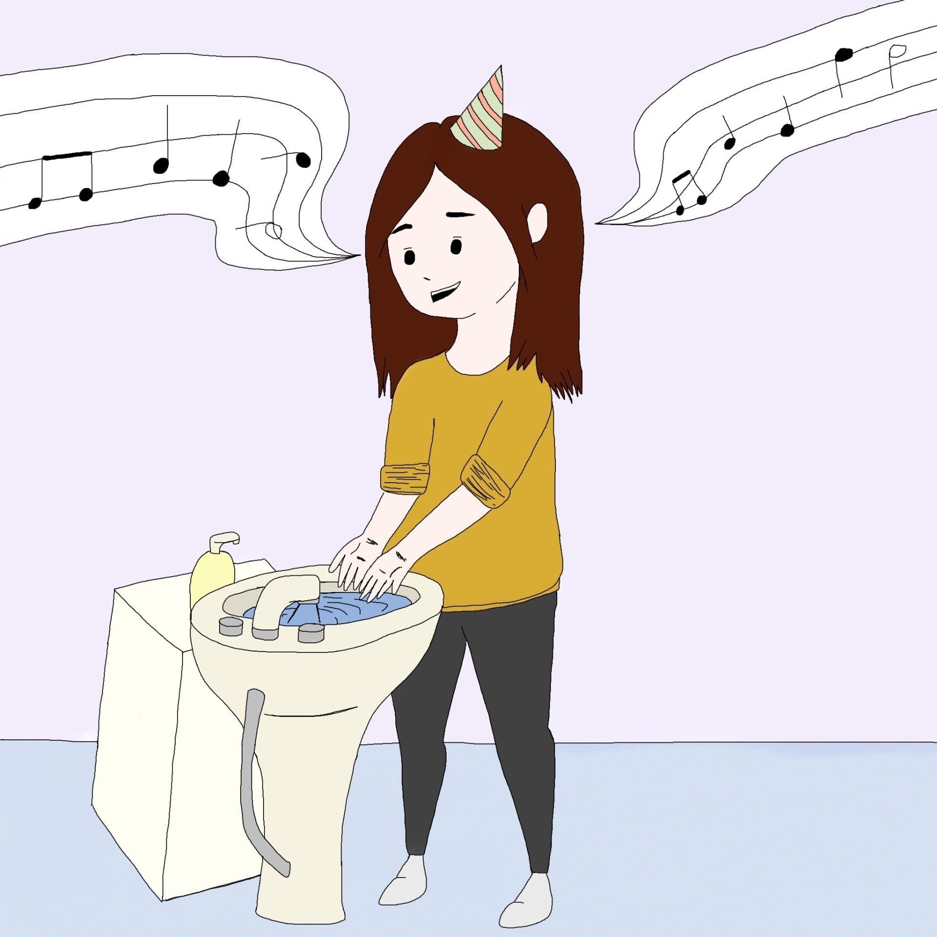
If the recent outbreak of Covid-19 has taught us anything, it's that many adults do not wash their hands effectively. It has never been more important that we support our children to develop good personal hygiene to keep themselves and our families safe. This seemingly easy task can be very difficult for children with fine motor skill difficulties. In this article, we explore some ideas to support your child with hand washing.

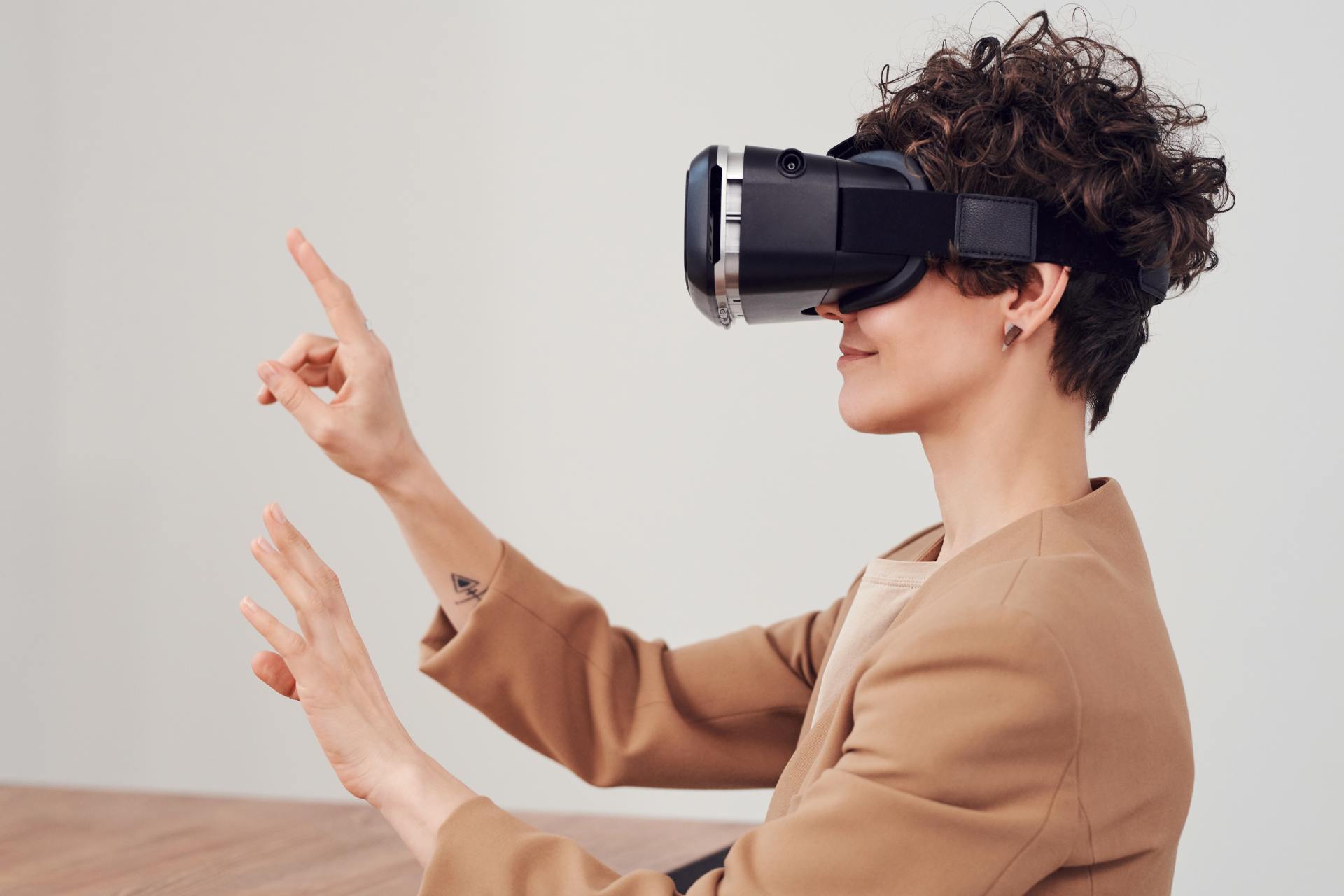
Lockdown has brought the digital future into the now. Online shopping, entertainment, education and more have moved from the periphery to the mainstream to, in many cases, the only option. With the necessity of social distancing looking to continue for many months, it appears that this rapid digital revolution is here to stay. This means that life as we know it, in most of its sectors, has changed forever. In order to survive, businesses are having to adapt rapidly, embrace technology and look to the future. Architecture is no exception. There has been a widespread adoption of technology and VR over the past few months in response to the lockdown across all of society. Elderly grandparents who were once resistant to adopt new technologies talk of “Zooming” and have started video chatting with their family members to combat loneliness. Art galleries that were once considered stuffy or pretentious are now pioneers in VR technology, with Google Art & Culture offering tours of London’s National Gallery or the Musee D’Orsay in Paris. These virtual tours deliver art in a dynamic new way that can be far more engaging than regular photos. Critics have applauded the panoramic and immersive views of gallery building and exhibitions which work well for rendering of 2 dimensional art, however impressions of sculpture is somewhat lacklustre. With VR technology, users can enjoy a truly immersive experience in the comforts, and safety, of their own home. The COVID-19 pandemic has served as an accelerant for the arts and entertainment industries to embrace VR.


