


Scriba Spotlight: Susan Szecsi
Website Editor • February 26, 2020
Everyone’s work is deeply idiosyncratic: in our regular Spotlight segment we explore artists’ experiences and inspiration to understand what defines and inspires their unique styles.
Susan Szecsi is a designer who designs human like fantasy game characters. In this article Susan will go through the step by step process she uses when she is designing these characters.
Step 1. How to start and what to look at the references
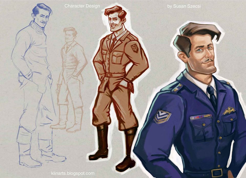
I almost always start the job with researching and collecting references. Looking at them helps to feel the atmosphere of the era and you will see clearly the hairstyle and clothing or other props that can add to the character. In this case the blue line drawing on the left is the first sketch based on a real British fighter's vintage photo. He is wearing a pullover with a unbuttoned jumpsuit. His carefully trimmed mustache is very stylish. I made his face more characteristic, slightly based on another contemporary pilot's features. Although I liked his natural and confident look he was not what I was looking for. I was drawing him because I thought his study would help me to create the fictional pilot for the game. To get that look some exaggerations were needed.
Step 2. Exaggerating, checking, refining and... sometimes let it go
Admitting (after a satisfying first sketch or study) that your second approach is a failure is not easy. The smallest light brown sketch (only lines, no blocking) shows an abandoned version where I was going in the wrong direction. I drew it over the first sketch, but now our hero is wearing a uniform. Unfortunately, his posture is not specific enough, his facial features are way too general, and his body type is average. It is a good example for a bad design. He is so uninteresting and somehow rigid the best we can do is just let it go and start all over. It is always good to make thumbnails with loose, sleekly, straight, and curvy lines. Draw the spine, a kind of simplified skeleton of the guy, to get the character anatomically correct. I use my other references, sometimes 2 to 6 photos to get the right posture. Family members or friends have to pose when there is no other way to get it right. There is no detailed rendering that can fix a wrong or uninteresting posture.
Step 3. How to refine or modify your character
Since the aim was to provide not an artistic or lifelike, but rather a game-fitting guy I started to play with the proportions. By simplifying the lines I was looking to find, while keeping his posture in mind, it should suggest confidence with a hint of an easygoing attitude but somewhat arrogant as well. He knows he is good looking and after dozens of fights shooting others and almost being killed, he sees the world with different eyes. He does not give a damn about what Mr X thinks of him. On the other hand, he is not cynical but rather smart and charming with a dry sense of humor. So, I broadened his shoulders and slimmed his waist. Not only did he get an almost sculpted hairstyle, but his jawline got more square like and his chin came forward. I love rendering and get carried away easily by colouring or refining details, so I worked only with values as you see it in the brownish blocked image in the middle.
Step 4. Further refining, checking, and experimenting
It is always a good idea to swap the canvas horizontally, or in the case you are not working digitally, using a mirror. It helps to see your drawing with fresh eyes and mistakes will pop up. Working digitally you have the opportunity to check the values when you look at your design in grey scale. The coloured close up shows more rendering. In fact, I have made 4-6 more versions of the character. However, I did not find them acceptable yet. I am going to continue to simplify him.
Thank you for reading. If you have any questions just drop me a comment. You can see more of my work at klinarts.blogspot.com
Scriba is a revolutionary digital stylus that is ergonomically designed to comfortably fit your hand and uses unique Squeeze-Motion technology. Order here.
Articles

The United Nations has described the disruption to education caused by the pandemic as ‘unparalleled’. At the virus’ worldwide peak in April, it is estimated that over 90% of all enrolled learners, from kindergarten to bachelors and beyond, had their education affected by school closures and the pandemic (UNESCO). For many university students and older children, they have had to adapt quickly to online learning. They can keep in touch with their peers and teachers online and continue their studies, albeit in a highly modified way. As challenging as this may be, this experience will help equip them for a future that is increasingly online. For parents of younger children, they are assuming a new role: their child’s home school teacher. This is in addition to their usual childcare and household duties, their work responsibilities and often emotional and financial worries caused by the pandemic. Stressful? Yes. The good, and somewhat surprising, news? The experts advise that you don’t teach your children - at least not in the way you might expect.

If the recent outbreak of Covid-19 has taught us anything, it's that many adults do not wash their hands effectively. It has never been more important that we support our children to develop good personal hygiene to keep themselves and our families safe. This seemingly easy task can be very difficult for children with fine motor skill difficulties. In this article, we explore some ideas to support your child with hand washing.
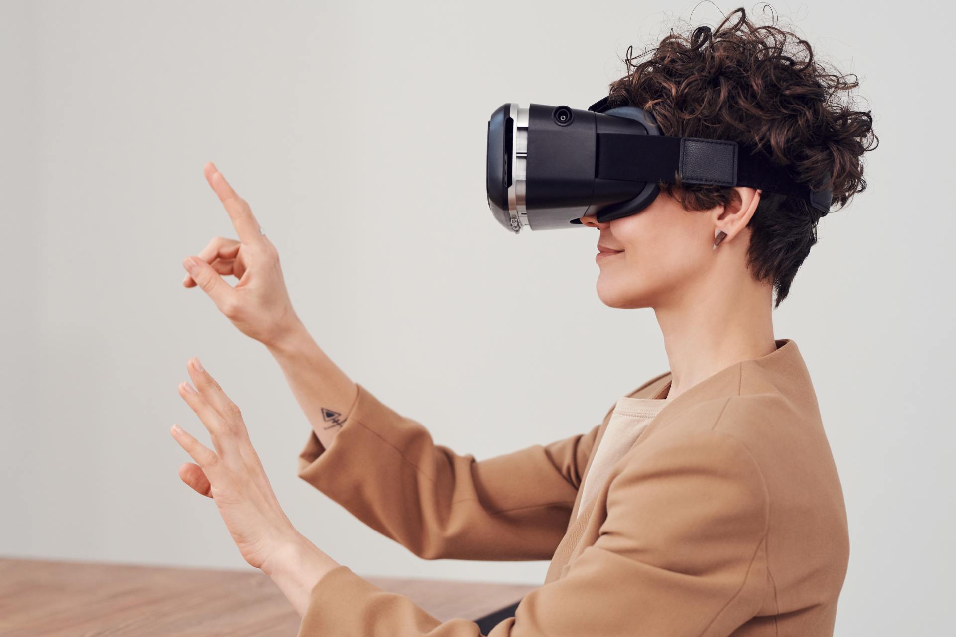
Lockdown has brought the digital future into the now. Online shopping, entertainment, education and more have moved from the periphery to the mainstream to, in many cases, the only option. With the necessity of social distancing looking to continue for many months, it appears that this rapid digital revolution is here to stay. This means that life as we know it, in most of its sectors, has changed forever. In order to survive, businesses are having to adapt rapidly, embrace technology and look to the future. Architecture is no exception. There has been a widespread adoption of technology and VR over the past few months in response to the lockdown across all of society. Elderly grandparents who were once resistant to adopt new technologies talk of “Zooming” and have started video chatting with their family members to combat loneliness. Art galleries that were once considered stuffy or pretentious are now pioneers in VR technology, with Google Art & Culture offering tours of London’s National Gallery or the Musee D’Orsay in Paris. These virtual tours deliver art in a dynamic new way that can be far more engaging than regular photos. Critics have applauded the panoramic and immersive views of gallery building and exhibitions which work well for rendering of 2 dimensional art, however impressions of sculpture is somewhat lacklustre. With VR technology, users can enjoy a truly immersive experience in the comforts, and safety, of their own home. The COVID-19 pandemic has served as an accelerant for the arts and entertainment industries to embrace VR.
